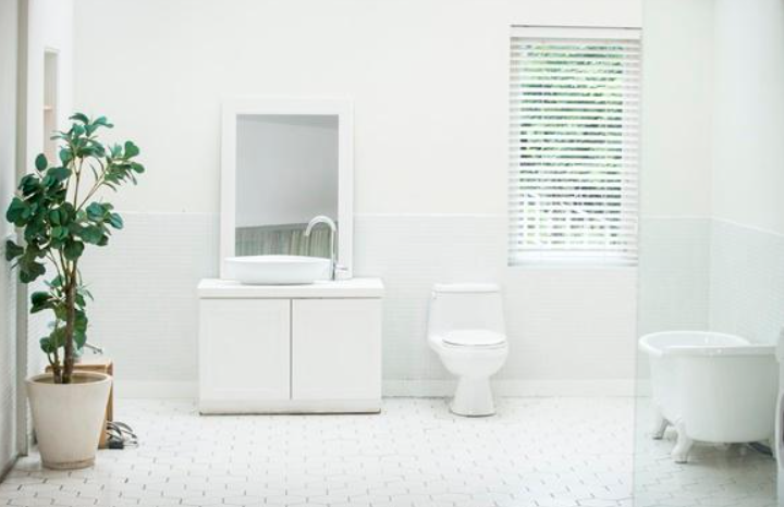
Brilliant bathroom, Soft Bathroom
If you go on a trip and take a bath in warm water in a shiny and soft bathroom, and at home you just shower in a very short time, let’s turn to today’s article.
Here’s the answer to the discomfort that occurs spontaneously when you walk into the bathroom, because of an old and weathered bathroom over time.
This is a bathroom renovation. Of course, for those who have never tried remodeling, remodeling can be a question mark. This is due to the suspicion that remodeling can magically change our decrepit and dilapidated bathroom. So, today we present an article on bathroom remodeling that will dispel those doubts. Magical bathroom remodeling before and after transforms a messy bathroom into a stylish and beautiful one!
Let’s now take a look at each of them.
1. Before: A boring bathroom with the worst color combination.
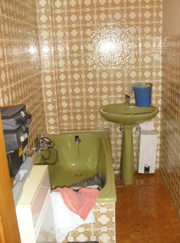
Even at first glance it was a bathroom with a gloomy and dreary atmosphere. The dark brown matte tiles and the muted green basin and tub were totally out of harmony.
Modern bathroom design
1. After: Simple and modern design in white.
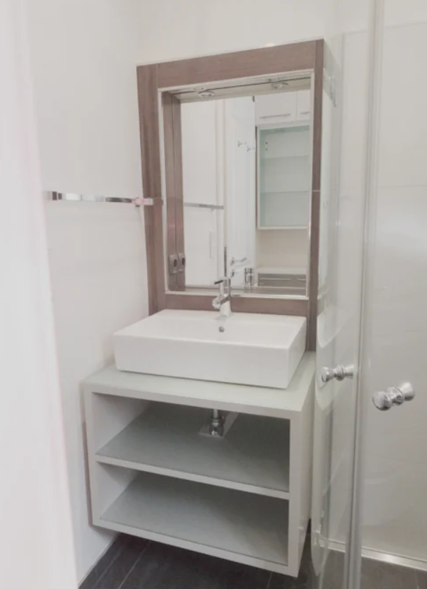
Storage space was in short supply, so cleaning supplies and laundry were scattered around the tub and sink, and the bathroom, which had an unbalanced dingy green-brown color before the renovation, was transformed into a completely different look after the renovation.
It has been transformed into a simple and modern white color, and a lower cabinet has been provided under the sink to provide not enough storage space. Also, it’s worth noting that the shower enclosure was installed in the corner instead of the tub, which was a waste of space to increase the use of space.
2. Before: Gloomy bathroom with trendy vintage tiles.
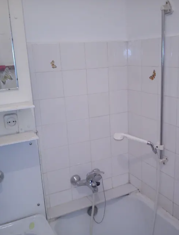
The fact that a bathroom is decorated in white does not necessarily mean that it is stylish and fashionable. If you look at the bathroom before the renovation in the photo, you will see that even with white tiles, the bathroom looks flat and decrepit due to the wrong choice of lighting and the wrong choice of tile size and design.
Bathroom with a shower
2. After: The bathroom is tiled in a modern style and equipped with a shower cabin.
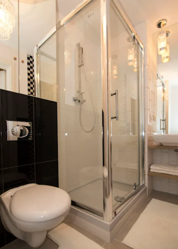
After the renovation, we were able to create a modern and stylish bathroom by removing the tiles that gave it a dilapidated look and the tub that was only taking up space, and tiling it in black and white along with a high-space corner shower enclosure.
In addition, unlike the existing bathroom lighting, a colorful mini chandelier was installed on the ceiling and a pendant daylight fixture above the sink to give the modern bathroom a softer look.
3. Before: A bathroom that looked empty and lifeless.

Spacious bathrooms are always welcome. However, like the bathroom in the photo, the bathroom is decorated in white and looks lifeless because it is flat. In response to a client’s request for a lively and warm bathroom, take a look at the photos below to see how this abandoned bathroom has been transformed.
Bathroom in the loft
3. After: A bathroom full of vitality and warmth.

There are no particular differences from the bathroom before the remodel. It would be more accurate to say that the style was new rather than remodeled.
The bathroom’s sloping ceiling and hidden storage cabinets were painted blue to give them vitality.
And thanks to the wooden supports, the bathroom has a warm and soft atmosphere.
4. Before: A bathroom that looks smaller than it really is.
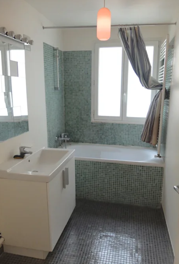
Bathroom before the renovation, but it looks stylish and beautiful However, the large bathtub made the bathroom seem narrower than it actually is.
And to take a dry bath, the shower curtain installed in the bathroom blocked the sunlight coming in through the window every time, creating a gloomy atmosphere in the bathroom.
Bathroom with a sense of openness
4. After: A bathroom with a sense of openness.

Take a look at the bathroom in the photo, renovated by the Parisian interior designer ESPACES À RÊVER. After the renovation, the bathroom looks bright and spacious to the extent that it cannot be seen as the same bathroom as it was before the renovation.
By removing the bathtub, which was taking up a very large area, and the shower screen with a large glass floor, a fresh and open bathroom has been completed.
5. Before: A bathroom with zero capacity and a sagging atmosphere.
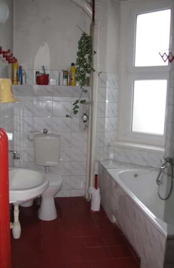
Through the bathroom in the photo, we can feel the passage of time. Fancy tiles on the walls and tubs and muted brown tiles on the floor, reminiscent of old public toilets, give the bathroom a wet feel.
In addition, the bathroom was inefficient before the remodel, and she had no choice but to place cleaners and bath products on the corner of the tub and on small shelves because of the difference in the wall steps, because there was no proper storage space.
Bathroom with increased capacity
5. After: A beautiful bathroom with increased capacity.

A beautiful bathroom that surprised us so much that it wasn’t a remodel, but magic unfolding before our eyes.
The bathroom was given a simple but modern look by removing all the old-fashioned and dull tiles and installing long white tiles that resembled wood materials. And by installing a built-in shelf with recessed lights, a lower cabinet under the sink, and a mirrored cabinet, we were able to solve the storage problem caused by the lack of storage space.

